
General interviewing results

Introduction

General interviewing analysis provides an overview of responses to basic survey questions. Navigate between questions using the left panel.
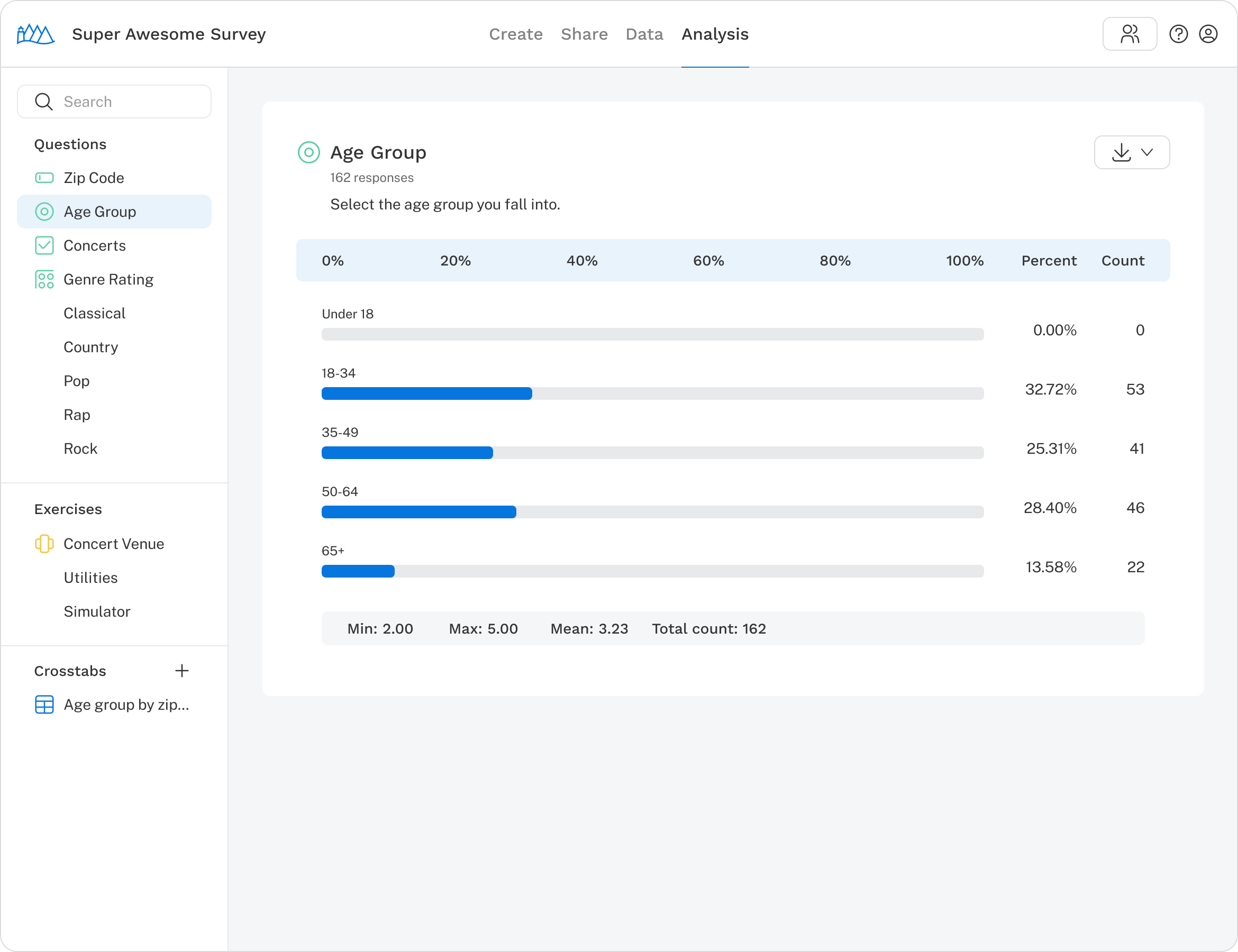
Analysis is open to a single select chart.

To download data for a specific question, click the Download button (Download Icon) in the top right corner of the question result. Results can be exported as an Excel spreadsheet. If a result includes a chart, it can also be downloaded as a PNG.

For a question, options for downloading a summary or a chart may be available.

To download results from all questions at once, use the options menu in the left navigation panel.
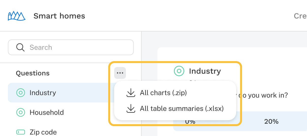
Analysis   Download All

Multiple choice

Single-select

Results are divided into four sections:

  1. The number of respondents who answered the question.
  2. A bar chart showing selection percentages. Each percentage represents the share of respondents who selected that item. Since only one item can be selected, percentages add up to 100%. For example: “40% of respondents who answered this question fall into the 50–64 age group.”
  3. Count: the total number of times each item was selected.
  4. Summary statistics:
    • Min: the minimum response value chosen.
    • Max: the maximum response value chosen.
    • Mean: the average of values chosen.
    • Responses: the total number of respondents who answered the question.
A Single Select Question Report with the four pieces above labeled.

Multi-select

Results are divided into three sections:

  1. The number of respondents who answered the question, defined as those who selected at least one option.
  2. A bar chart showing selection percentages. Each percentage represents the share of respondents who selected that item. Since respondents can select multiple items, each item can independently reach 100% and the combined total will typically exceed 100%. For example: “50% of respondents who answered this question say they use their laptop at work.”
  3. Count: the total number of times each item was selected.
  4. Responses: the total number of respondents who answered the question.
A Multi Select Question Report with the four sections above labeled.

Grid

Grid questions show results in two ways: a heat map of all rows and columns together, followed by a breakdown of each individual row.

Heat map

Using a single-select grid as an example, where respondents rate three music genres on a scale of 1 to 5, the heat map has four components:

  1. Total responses: the number of respondents who answered the question. For multi-select grids, this includes respondents who selected at least one option in any row.
  2. Column labels: the labels for each scale point.
  3. Rows and cells: each row corresponds to a response option and is made up of cells representing scale points. Each cell shows a percentage and count — for example: "20% of respondents who answered this question, or 2 people, rated Alternative as a 1."
  4. Count: the total number of respondents who answered each row. If the question is required, this count is the same for every row.
The four Grid Question Report sections above are labeled.

Individual row reports

Below the heat map, a detailed report is shown for each row, presented similarly to a multiple choice question. The layout differs slightly between single-select and multi-select grids. See the multiple choice section above for more on how results are displayed.

The two Grid Row Report sections above are labeled.

Open-end

Open-end results are divided into two sections:

  1. A table of verbatim responses.
  2. The option to run AI analysis for a written summary, sentiment breakdown, and categorization by theme.

Open-end AI analysis

AI analysis generates insights based on all responses to an open-end question. Click Run AI analysis on any open-end result to get started. This feature is available on paid plans.

Note: AI may make mistakes. Verify all outputs for accuracy.

Once complete, the results panel displays:

  1. AI summarization: A paragraph summarizing key themes and patterns across all responses.
  2. AI sentiment: A bar chart breaking responses into four categories: positive, neutral, negative, and undetermined. Each shows a percentage and count. A mean sentiment score and total response count appear below the chart.
  3. AI categorization: A table grouping responses into thematic categories. Each row includes the category name, count, a brief description, and representative response excerpts.

As new responses come in, re-run the analysis at any time by clicking Run AI analysis in the banner that appears. Each run reflects all responses collected up to that point.

Constant sum

Results are divided into three sections:

  1. Total responses: the number of respondents who answered the question, defined as those who filled in at least one field.
  2. Bar chart: displays the average allocation for each response option. The scale is dynamic based on the maximum allowable value for the question.
  3. Response distribution table: shows the distribution of responses for each list item.
The three sections of a Constant Sum Report are labeled.

Numeric

Results are divided into three sections:

  1. Total responses: the number of respondents who answered the question.
  2. Response list: a list of all responses received.
  3. Summary statistics: min, max, mean, and responses, shown below the chart.
    • Min: the minimum value entered.
    • Max: the maximum value entered.
    • Mean: the average of values entered.
    • Responses: the total number of respondents who answered the question.
Example Report for the Numeric Question

Text entry

If a question includes a text entry item such as "Other, please specify," results appear in two sections:

  1. A bar in the question chart indicating how many respondents selected the text entry option.
  2. A table below the chart showing the actual responses entered.
The two sections of the text entry question results described above are labeled.