Introduction
Input fields in Discover, such as question text and list items, support text formatting. Larger fields like question text display formatting options when you click into the field.
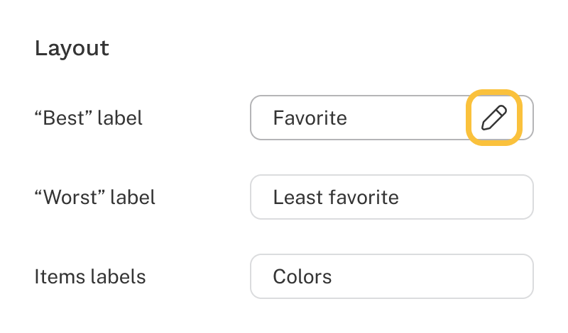
For smaller inputs like labels, click the pencil icon to access formatting options.
Supported formatting options:
- Bold (⌘B or Ctrl+B)
- Italic (⌘I or Ctrl+I)
- Underline (⌘U or Ctrl+U)
- Text color
- Alignment
- Bulleted list
- Numbered list
- Links
- Images
- Tooltips
To undo formatting, highlight the formatted text and click the Clear formatting button ().